
Visual Brand Language: How to Create an Identity That Will Be Remembered at First Sight
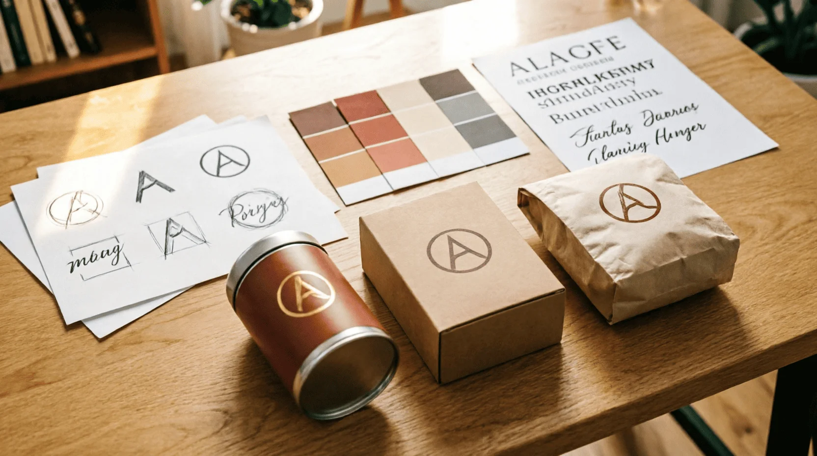
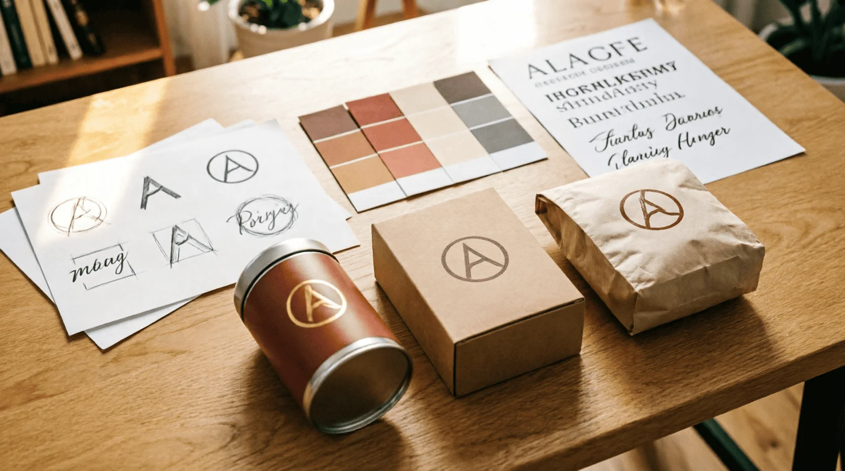
A logo is the tip of the iceberg. Beneath it lies a system of colors, fonts, shapes, and rules that make a brand recognizable without a name. A good visual language works across all media: from a business card to a storefront, from a website to packaging. TeamLemag.kzI explored how Kazakhstani entrepreneurs can create an identity that's memorable at first glance—with a checklist, budgets, and rules to avoid "design for design's sake."
1. What is Visual Language: Five Layers of the System
? Color palette.2-3 primary colors + 1-2 accent colors. Color is the first signal, read within 0.1 seconds: orange signifies "energy and warmth," blue "reliability," and black "premium."
✍️ Typography.Two fonts maximum: one for headings (character), one for body text (readability). The font is the brand's voice: strict, friendly, and modern.
Shape and geometry.Rounded corners convey "friendliness," sharp corners convey "precision," and circles convey "integrity." The shape works even without a logo: the silhouette of the packaging is sufficient.
? Rhythm and grid.Spacing between elements, alignment, proportions. Rhythm creates order: a chaotic layout screams "unprofessional," even if the logo is beautiful.
Signs and symbols.Icons, patterns, and graphic elements that are repeated across all media. This is the brand's "vocabulary": a set of visual words that underpin communication.
Visual language is not decoration, but a decision-making system: it answers the question "how should this look?" without lengthy discussions.
2. Why Small Businesses Need a Visual Language: Three Reasons
? Recognizability.The client sees your color and shape in their social media feed and understands who you are even before reading the name. This saves money on advertising: a repeat contact costs five times less than the first one.
? Trust.A professional identity says, "We're here to stay." Inconsistent colors and fonts scream "temporary project"—even if the product is excellent.
Saving on solutions.When there's a guideline, a designer doesn't ask, "What color should I choose?" – they consult the rules. Every new business card, post, or packaging is created in minutes, not hours.
We discussed the business impact of visual identity in detail in our article on business ideas for 2026: where visual language works, sales are 20–30% higher.
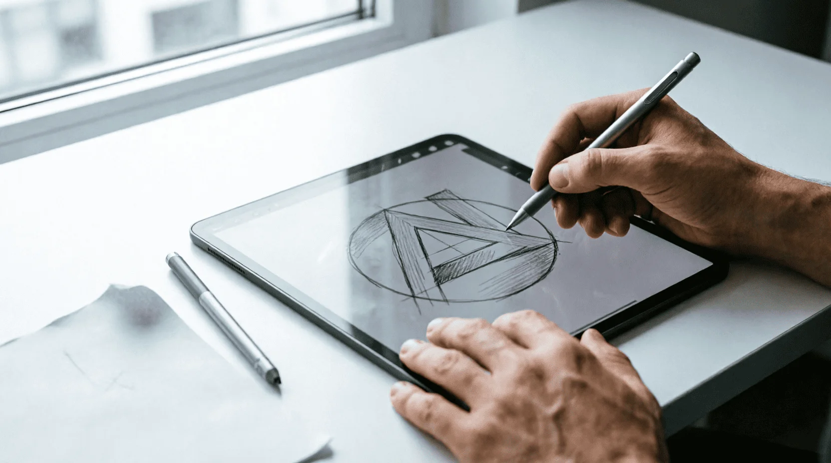
3. Logo: One sign that holds it all together
A logo is the anchor of a system, not the entire system. A good logo:
Works in one color.If a logo loses its meaning without a gradient or three colors, it's weak. Test: print it in black on white—is it legible?
Scalable.From a 16x16 favicon to a billboard, the logo remains recognizable. If details get lost when scaled down, simplify.
? Lives longer than trends.The minimalism of the 2020s is giving way to the maximalism of the 2030s; a good logo outlives fashion. Avoid decorative elements that will become outdated within two years.
Context.A coffee shop logo and a law firm logo are worlds apart. The designer considers the context of use: a sign, an app, a courier uniform.
4. Color Palette: Emotions in Numbers
Color is not a matter of "like/dislike", but rather psychology + functionality:
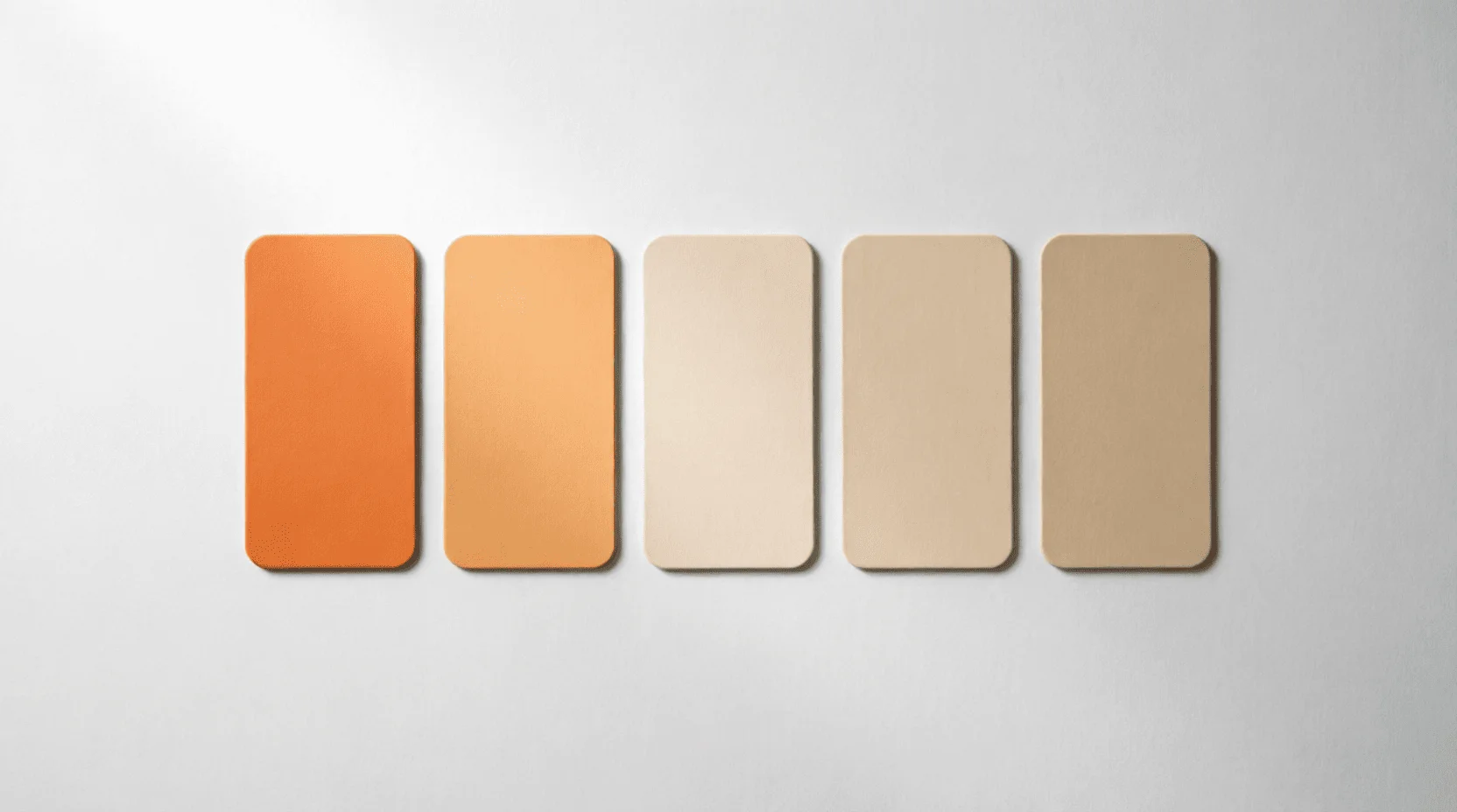
? Psychology.Red - energy and urgency (used in sales); blue - trust (banks, technology); green - health and nature; orange - friendliness and warmth (popular in Kazakhstan as the "steppe" color).
? Functionality.The primary color is for key elements (buttons, accents); the background color is for large surfaces; the accent color is for highlights. Rule: 60% background, 30% primary, 10% accent.
♿ Availability.Text and background contrast should be sufficient for people with visual impairments. Tools like WebAIM Contrast Checker check color pairs in seconds.
? Cultural context.In Kazakhstan, warm earth tones (ochre, terracotta, milky) work better than cool northern palettes – they resonate with the landscape and tradition.
5. Typography: Brand Voice in Letters
Font is intonation. Two fonts are enough:
? Characteristic (headlines).One font with a strong character: geometric grotesque for technology, serif for tradition, handwritten for craft brands.
? Neutral (text).Readable fonts for long texts: Inter, Roboto, Open Sans. Experimentation isn't needed here—clarity is key.
Rules of application.Headings - only characteristic; main text - only neutral; numbers and tables - monospaced (if necessary). No "beautiful" fonts outside the system.
?? Kazakh context.Make sure the font supports Kazakh characters (ә, і, ң, ғ, ү, ұ, қ, ө, һ). Many fonts break on specific letters—check before you approve.
6. Packaging and media: where the brand lives
The visual language is tested on native speakers:
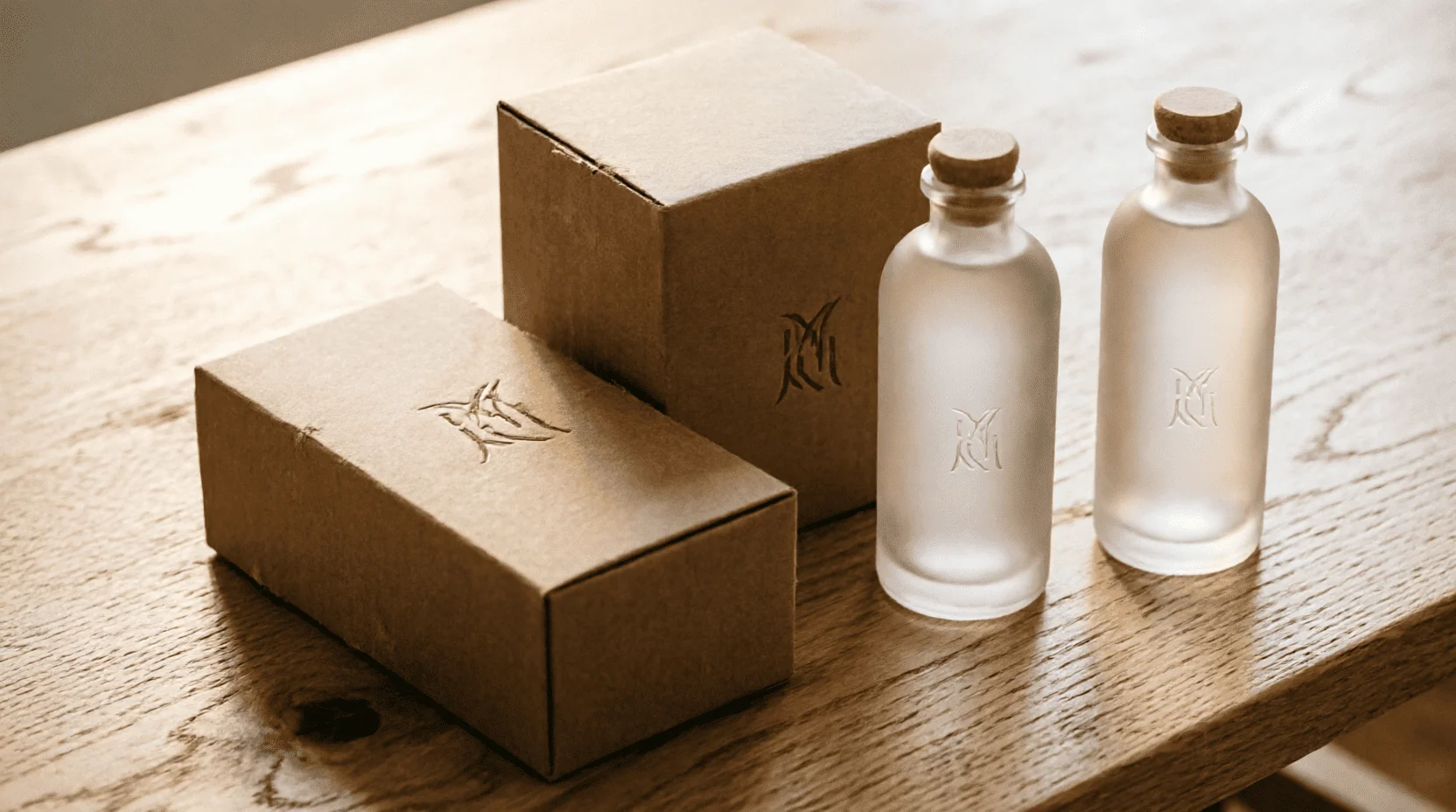
? Packaging.Kraft boxes with minimal print work for craft products; brightly colored plastic for mass-market products; and glass bottles with labels for premium products. Packaging is the first physical contact with the brand.
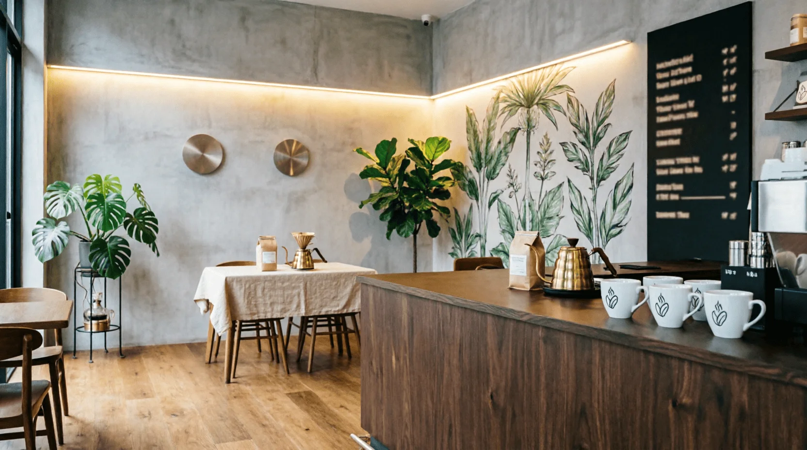
? Showcase and sign.Visual language should work from a distance of 10 meters (a sign) and 30 centimeters (a package in your hand). If a logo is only legible up close, it won't work outdoors.
? Digital media.Websites, apps, and social media—here, the visual language adapts to screens: colors can become brighter (the screen eats up contrast), fonts can become larger.
Clothing and uniform.A courier's or barista's uniform is a walking advertisement. The visual language on the uniform should be recognizable even without a logo: color and pattern are sufficient.
7. One-page guideline: the bare minimum that saves
A 50-page brand book is required for corporations; for small businesses, one page is enough:
? What to include:
- Logo:main style + minimum size + security margin (indents around);
- Palette:HEX codes of colors + rules of proportions (60/30/10);
- Fonts:titles + where to apply (headings/text);
- Rules:what is not allowed (distorting the logo, changing colors, using decorative fonts outside the system);
- Examples:3-4 visualizations of media (business card, postcard, packaging).
? Format:A single-page PDF + a folder with source files (SVG logo, fonts, palette). Handed over to the designer, printing house, and SMM manager—everyone is working from a single source of truth.
8. Budgets: How much does visual language cost in Kazakhstan?
? Hypothesis testing (0-50 thousand ₸).Canva + free fonts + AI logo generation (Midjourney, DALL-E). Good for testing ideas; not suitable for a serious brand.
? Basic set (150-500 thousand ₸).Freelancer or aspiring designer: logo + palette + fonts + one-page guidelines. Enough for a start and initial media.
? Full guideline (1-3 million ₸).Studio or experienced designer: research + concept + logo + full system + brand book + implementation support. For brands planning to scale.
? Corporate level (from 5 million ₸).Agency: strategy + naming + visual language + communication + implementation. For large companies and franchises.
Rule:Invest in a visual language after product validation and initial sales. A beautiful brand without customers is an expensive toy; a working product with a distinctive identity is an asset.
9. The creation process: from brief to implementation
? Five stages of working with a designer
- Brief (1-2 days).Fill out the document: who your clients are, how you differentiate yourself from your competitors, what emotions you want the brand to evoke, and examples of "likes/dislikes." Without a brief, a designer is working blind.
- Research (3-5 days).The designer analyzes competitors, target audiences, and trends. The result is a mood board with specific directions.
- Concepts (5-7 days).2-3 visual language options: logo + palette + media samples. Choose one and refine the details.
- Guideline (3-5 days).Finalization of the system, creation of a one-page document, transfer of source codes.
- Implementation (week+).Initial media: business cards, social media, packaging. The designer provides support and answers questions.
Rule:Don't rush the research and concept stages—this is where the foundation is laid. Saving days at the start is worth months of rework later.
10. Links to other Lemag.kz articles
The visual language works in conjunction with our materials:
Neonomadism- If you use the Kazakh cultural code, this article explains how to do it tastefully, without kitsch.
Business ideas 2026- Identity increases sales in niche categories such as gift items, coffee, and tourism.
AI time management- AI tools (Midjourney, DALL-E) help generate mood boards and concepts during the research phase, saving the designer time and your money.
11. Mistakes that kill visual language
A beautiful logo without a system is like a beautiful facade without a foundation: it looks good, but it can't support the load.
? Too many flowers.A 7-color palette becomes a chaos on media. Rule: 2 primary colors + 1 accent color maximum.
? Fonts "for beauty".Decorative fonts in text reduce readability and look unprofessional. Save character for headings.
? Lack of rules.Without guidelines, every designer, SMM specialist, and typographer does things "as they feel," resulting in inconsistency. A one-page document prevents this.
? Copying competitors.Your visual language should differentiate you, not make you look like the market leader. Competitor research is essential for differentiation, not copying.
Result:A brand's visual language isn't just about "pretty pictures," but an investment in recognition and trust. For a Kazakhstani entrepreneur in 2026, a one-page guide and a budget of 150,000 tenge are enough to create a system that works across all media and saves time on decision-making. Start with a brief and research, and in a month, you'll have a brand that's instantly memorable. ?
❓ FAQ
How is visual language different from a logo?
A logo is a single element; visual language is a system: colors, fonts, shapes, rhythm, and application rules. A logo can be replaced; visual language determines recognition across all media.
How much does it cost to create a visual language in Kazakhstan?
From 150,000 tenge for a freelancer (logo and palette) to 2–5 million tenge for a studio (full guidelines). A basic kit for 300–500,000 tenge is enough to get started.
Is it possible to create a brand identity yourself in Canva?
A basic set of tools can be used to test a hypothesis; a serious brand requires a designer: they take into account the context, competition, and technical implementation on media.
How do you know if visual language is working?
Test: Show a brand without a name to three people – will they recognize you? Test two: Does brand identity work equally well on a business card, website, and sign?
Does a small business need a brand book?
A 50-page document isn't necessary; a one-page guide is sufficient: logo, palette, fonts, and usage guidelines. This prevents inconsistencies when scaling.
How to update your visual language without losing its recognizability?
Evolution, not revolution: keep the key element (color, shape, rhythm), change the rest. Example: Coca-Cola changes its fonts and packaging, but the red remains.
📚 Read also

Neuroaesthetics: How the Brain Perceives Design - From the Golden Ratio to Color Triggers: The Science of Beauty, Perception Psychology, and Practical Application
Why do some designs evoke delight and the desire to share, while others leave us indifferent? Neuroaesthetics is the science of how the brain processes visual information. The Lemag.kz team breaks down fundamental principles: the golden ratio, color triggers, attention patterns, and practical application in design, branding, and art.
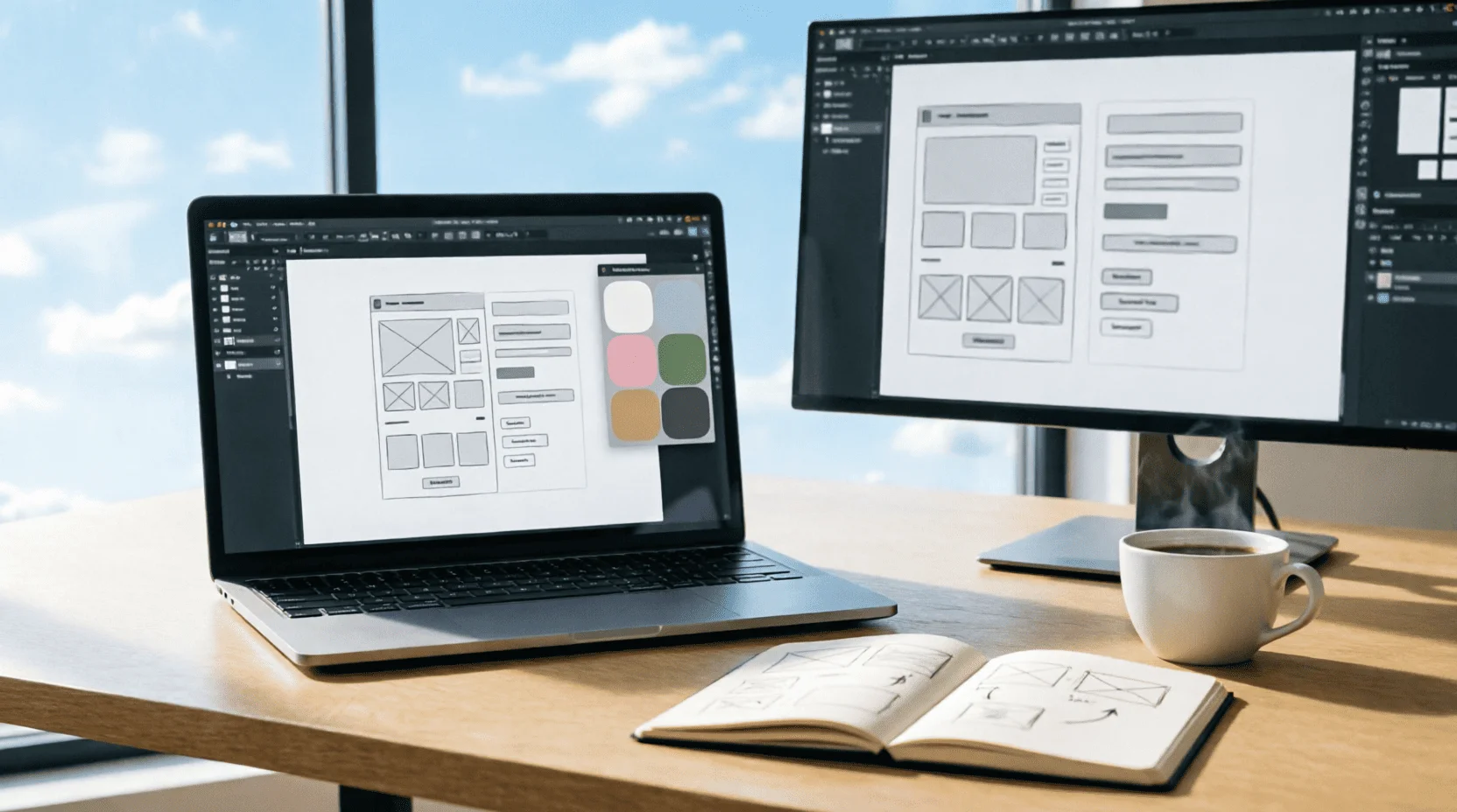
UI/UX-дизайн 2026: как стать востребованным дизайнером интерфейсов - от первого макета в Figma до зарплаты 1 млн тенге: портфолио, профессии, нейросети и вход в индустрию без диплома
UI/UX-дизайн - одна из самых востребованных креативных профессий 2026 года: зарплаты от 400 тысяч до 2 млн тенге, удалённая работа на зарубежные компании и вход без диплома. Команда Lemag.kz разобрала профессию без мифов: инструменты (Figma, AI), портфолио без опыта, зарплаты по уровням, казахстанский рынок и план первых 90 дней - от нуля до первого оплачиваемого проекта.
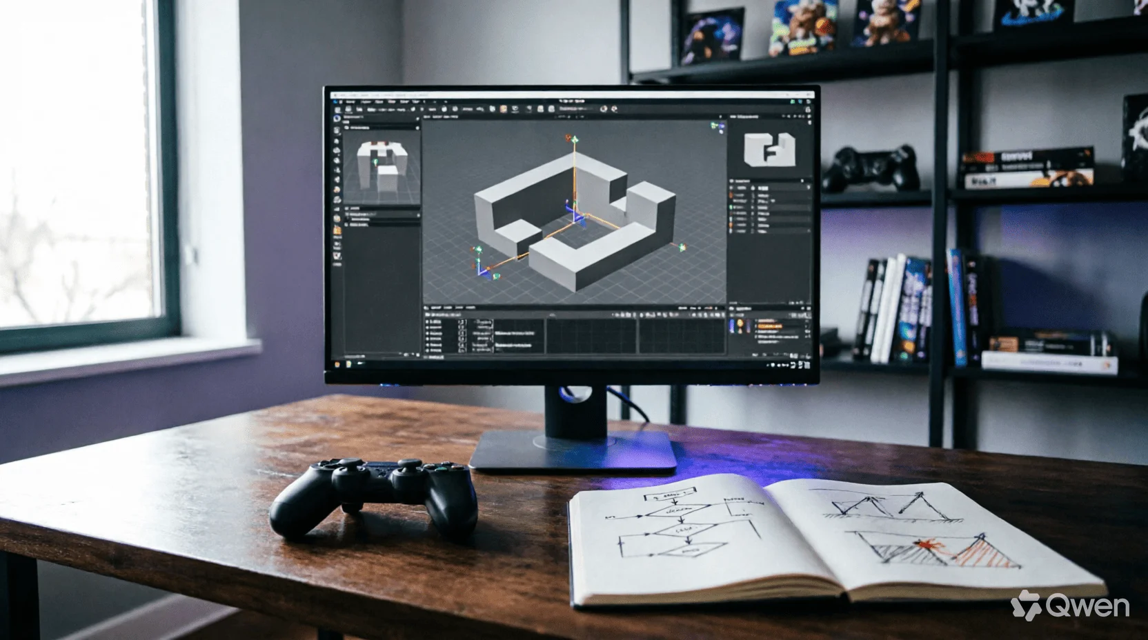
Геймдизайн 2026: как устроена профессия, которая соединяет все искусства - от core-loop до казахского сеттинга: движки, психология игрока, экономика F2P и вход в индустрию без диплома
Игры - единственная среда, где архитектура, музыка, нарратив и психология работают одновременно и подчинены одному решению геймдизайнера: что игрок почувствует в следующую секунду. Команда Lemag.kz разобрала профессию без романтизации: анатомия core-loop, сравнение движков 2026 года, тёмные паттерны монетизации и их этичные альтернативы, казахский сеттинг как конкурентное преимущество и реалистичный план первой игры за 90 дней - без диплома и без иллюзий.
💬 Comments (0)
No comments yet. Be the first!
Leave a comment
Comments are pre-moderated.