
Neuroaesthetics: How the Brain Perceives Design - From the Golden Ratio to Color Triggers: The Science of Beauty, Perception Psychology, and Practical Application
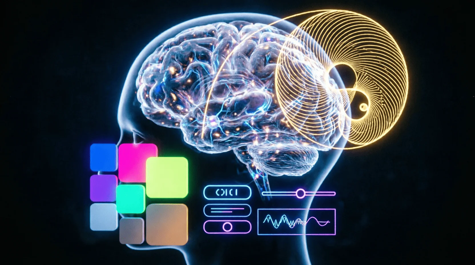
Why do some designs evoke delight and the desire to share, while others leave us indifferent? Why does the Apple logo seem "right," and why does Tiffany's color palette evoke a sense of luxury? The answers lie not in taste, but in neuroscience. Neuroaesthetics — a young discipline at the intersection of neurobiology, psychology, and art — studies how the brain processes visual information and why certain patterns are perceived as beautiful. The Lemag.kz team breaks down fundamental principles: from the golden ratio to color triggers, with practical application in design, branding, and art.
1. What is Neuroaesthetics: The Science of Perceiving Beauty
? Definition. Neuroaesthetics is a branch of cognitive neuroscience that studies the neural mechanisms of aesthetic experience: how the brain evaluates beauty, why some images are pleasing and others are not.
? History. The term was introduced by neurobiologist Semir Zeki in 1999; the founder is Professor Vilayanur Ramachandran of the University of California, who formulated the "8 laws of artistic experience."
? Research methods:
- fMRI (functional MRI): shows which brain regions are activated when viewing beautiful images;
- EEG (electroencephalography): measures electrical brain activity in real time;
- Eye-tracking: tracks eye movement, revealing attention patterns;
- Behavioral experiments: reaction time, preferences, emotional ratings.
? Main conclusion: Beauty is not a subjective concept, but the result of specific neural networks that can be measured and predicted.
2. The Golden Ratio: The Mathematics of Beauty
? What it is. The golden ratio (φ = 1.618) is a proportion where the ratio of the whole to the larger part equals the ratio of the larger part to the smaller part.
? Where it appears in nature:
- Nautilus shell spirals
- Sunflower seed arrangement
- Human body proportions (height to leg length)
- Tree branches, plant leaves
Why the brain loves the golden ratio:
- Evolutionary theory: the brain is tuned to patterns found in nature;
- Cognitive ease: proportions are easy to process, require no effort;
- Pleasure center activation: fMRI shows ventral striatum activity when viewing objects with the golden ratio.
Application in design:
- Logos: Apple, Twitter, Pepsi use the golden ratio;
- Web design: content-to-sidebar ratio (1:1.618);
- Photography: rule of thirds — a simplified version of the golden ratio;
- Typography: ratio of heading to body text sizes.
Practice: When creating a layout, divide the width by 1.618 — you'll get the perfect focal point.
3. Color Psychology: How Colors Affect the Brain
? Red:
- Neural effect: Activates the amygdala (emotions, arousal);
- Physiology: Increases pulse, blood pressure, appetite;
- Application: "Buy," "Urgent" buttons, fast food restaurants (McDonald's, KFC);
- Associations: Passion, danger, energy, urgency.
Blue:
- Neural effect: Reduces sympathetic nervous system activity;
- Physiology: Slows pulse, reduces anxiety;
- Application: Banks (Chase, Barclays), tech (Facebook, IBM, Intel);
- Associations: Trust, stability, professionalism, calm.
Green:
- Neural effect: Activates the parasympathetic system (relaxation);
- Physiology: Reduces stress, improves concentration;
- Application: Eco-brands (Whole Foods), finance (growth, money);
- Associations: Nature, health, harmony, growth.
? Yellow:
- Neural effect: Stimulates serotonin production;
- Physiology: Increases attention, mood;
- Application: Warning signs, children's brands, sales;
- Associations: Optimism, joy, attention, warmth.
Black:
- Neural effect: Activates regions associated with power and control;
- Application: Luxury brands (Chanel, Mercedes), minimalism;
- Associations: Luxury, elegance, power, mystery.
⚪ White:
- Neural effect: Reduces cognitive load;
- Application: Tech brands (Apple), minimalism, medicine;
- Associations: Purity, simplicity, space, perfection.
Rule: Choose color not by taste, but by the desired emotional response of your audience.
4. Attention Patterns: Where the Brain Looks
? Eye-tracking research shows:
- F-pattern: When reading web pages, eyes move in an F shape (horizontally across the top, then vertically down the left side);
- Z-pattern: When scanning simple pages, eyes move in a Z pattern (top left → top right → bottom left → bottom right);
- Fixation points: The brain focuses on faces, contrasting elements, movement.
? Practical application:
- Logo: Place in the upper left corner (first fixation point);
- CTA button: Contrasting color, 2–3 times larger than surrounding text;
- Faces in photos: Model's gaze should be directed at the CTA (reader follows the gaze);
- White space: Increases focus on key elements by 20–30%.
5. Symmetry and Asymmetry: Balance of Perception
⚖️ Symmetry:
- Neural effect: The brain processes symmetrical objects faster (by 10–15%);
- Evolution: Symmetry = health, genetic quality (in nature);
- Application: Classical design, logos (Mercedes, McDonald's), architecture.
? Asymmetry:
- Neural effect: Requires more resources, but creates interest and dynamism;
- Application: Modern design, creative brands, art;
- Rule: Asymmetrical balance (different elements, but equal visual weight).
Practice: For corporate style — symmetry (trust); for creative brands — asymmetry (interest).
6. Contrast and Hierarchy: How the Brain Organizes Information
Contrast principle:
- The brain automatically highlights elements that differ from their surroundings;
- Contrast can be: color, size, texture, spatial.
Information hierarchy:
- Heading: Large, contrasting (attracts attention);
- Subheading: Medium size, connects heading and text;
- Body text: Readable, comfortable;
- CTA: Contrasting color, call to action.
Neural mechanism: Contrast activates the orienting reflex — automatic direction of attention to a new stimulus.
60-30-10 rule: 60% dominant color, 30% secondary, 10% accent.
7. Movement and Animation: Capturing Attention
? Why movement works:
- Evolutionarily, the brain is tuned to detect movement (threat/prey);
- Movement activates the superior temporal sulcus (specialized region);
- Animation increases time on site by 20–40%.
️ Usage rules:
- Purposefulness: Animation should direct attention, not distract;
- Duration: 200–500 ms for micro-animations, up to 2 sec for transitions;
- Naturalness: Imitate physics (acceleration, deceleration);
- Moderation: No more than 2–3 animations on screen simultaneously.
Examples:
- Hover effects on buttons (feedback);
- Progress bars (waiting);
- Parallax scrolling (depth);
- Icon micro-animations (delight).
8. Faces and Emotions: The Social Brain
? Why faces are important:
- There is a specialized region in the brain — the fusiform face area (FFA);
- Infants recognize faces within hours of birth;
- Faces activate the amygdala (emotions) and prefrontal cortex (social cognition).
? Practical application:
- Marketing: Photos of people increase conversion by 30–40%;
- Gaze direction: Model looks at CTA → reader follows gaze;
- Emotions: Smile = trust, serious face = professionalism;
- Children: Activate protective instinct, increase engagement.
⚠️ Mistake: Stock photos with artificial smiles reduce trust; use real photos.
9. Simplicity vs Complexity: Cognitive Ease
? Cognitive ease theory:
- The brain prefers stimuli that are easy to process;
- Simple shapes, clear lines, familiar patterns = positive emotion;
- Complexity requires effort = negative reaction (if no motivation).
? Berlyne curve:
- Simple stimuli → boredom;
- Moderate complexity → interest, pleasure;
- Too complex → frustration.
? Application:
- Minimalism: Apple, Google — maximum simplicity;
- Maximalism: Gucci, Versace — complexity as style (for prepared audiences);
- Rule: Know your audience; mass market = simplicity, niche = complexity.
10. Texture and Tactility: Multisensory Perception
? Why textures work:
- The brain processes visual textures in the same region as tactile sensations;
- Textures create a sense of depth, reality, quality.
Design textures:
- Paper/cardboard: Eco-friendliness, handmade;
- Wood: Naturalness, warmth, tradition;
- Metal: Technology, precision, luxury;
- Fabric: Comfort, softness, homeliness;
- Concrete/stone: Reliability, minimalism, industrial.
Practice: Use textures to enhance the brand's emotional message.
11. Neuroaesthetics in Branding: Practical Cases
? Apple:
- Principles: Minimalism, white space, symmetry;
- Neural effect: Reducing cognitive load = sense of control and premium quality;
- Result: One of the world's most valuable brands.
? Coca-Cola:
- Principles: Red color (arousal), wavy shape (dynamism), recognizable font;
- Neural effect: Activation of pleasure and nostalgia centers;
- Result: 94% recognition worldwide.
? Mercedes-Benz:
- Principles: Symmetrical star, black/silver colors, strict lines;
- Neural effect: Associations with power, stability, luxury;
- Result: Premium segment, generational loyalty.
Airbnb:
- Principles: Warm colors, photos of real people, asymmetrical balance;
- Neural effect: Trust, belonging, adventure;
- Result: Growth from 0 to $100 billion in 15 years.
12. Neuroaesthetics in UI/UX Design
? Principles:
- Hick's Law: The more options, the longer the decision; simplify choice.
- Fitts's Law: Target size and distance affect acquisition time; make buttons large.
- Law of proximity: Elements close together are perceived as related; group logically.
- Law of similarity: Similar elements are perceived as related; use for navigation.
? Practice:
- CTA buttons: Contrasting color, minimum size 44×44 px;
- Forms: No more than 5–7 fields (working memory);
- Navigation: No more than 7±2 items (Miller's law);
- Feedback: Micro-animations on actions (dopamine reinforcement).
13. Neuroaesthetics in Art: Why Paintings Sell for Millions
? Research:
- Paintings with the golden ratio sell for 20–30% more;
- Warm colors (red, orange) evoke higher bids at auctions;
- Faces in paintings increase viewing time by 40%.
? Examples:
- Mona Lisa: Golden ratio, enigmatic smile (FFA activation);
- Van Gogh's Starry Night: Movement, contrast, emotionality;
- Malevich's Black Square: Minimalism, provocation, cognitive dissonance.
? Conclusion: Art that corresponds to neural patterns is valued higher.
14. How to Develop Aesthetic Perception
? Training methods:
- Visual exposure: 30 minutes a day study masters' works (Behance, Dribbble, museums);
- Analysis: Analyze why design works (colors, composition, typography);
- Copying: Repeat masters' works to understand technique;
- Critique: Get feedback from experienced designers;
- Variety: Study different styles (minimalism, maximalism, classic, modern).
⏱ Timeline: 6–12 months of regular practice for noticeable improvement.
? Neural mechanism: Neuroplasticity — the brain forms new connections with repeated experience.
15. Neuroaesthetics Checklist for Designers
✅ When creating a design, check:
- [ ] Is the golden ratio or rule of thirds used?
- [ ] Does the color match the desired emotion?
- [ ] Is there a clear hierarchy (heading → text → CTA)?
- [ ] Are key elements contrasting?
- [ ] Is there white space for focus?
- [ ] Are faces used (if appropriate)?
- [ ] Is navigation simple (Hick's law)?
- [ ] Is there feedback on actions (animations)?
- [ ] Does the style match the target audience?
- [ ] Does it pass the "5-second test" (what is remembered immediately)?
16. Connection to Other Lemag.kz Articles
? UI/UX Design — practical application of perception laws in interfaces.
? Game Design — how game design uses dopamine cycles.
? Typography and Branding — how fonts affect brand perception.
? Neural Networks for Content — AI as a tool for creating aesthetic content.
Conclusion: Neuroaesthetics is not magic, it's science: the brain processes visual information according to specific laws that can be studied and applied. The golden ratio, color psychology, attention patterns, contrast, and hierarchy are tools that turn design from a subjective "like/dislike" into a predictable result. Start with the checklist, study the works of masters, and test solutions on your audience — and in 6–12 months you will create designs that are not just beautiful, but work at the neural level. ?✨
❓ FAQ
Что такое нейроэстетика?
Нейроэстетика — раздел нейронауки, изучающий, как мозг воспринимает и оценивает красоту, искусство и дизайн; исследует нейронные механизмы эстетического опыта.
Почему золотое сечение считается красивым?
Золотое сечение (1:1.618) встречается в природе (спирали ракушек, пропорции тела) и активирует зоны мозга, связанные с удовольствием; мозг эволюционно настроен на эти пропорции.
Какие цвета вызывают какие эмоции?
Красный — возбуждение, срочность; синий — доверие, спокойствие; зелёный — гармония, природа; жёлтый — оптимизм, внимание; чёрный — роскошь, власть; белый — чистота, минимализм.
Как дизайн влияет на поведение?
Определённые паттерны (симметрия, контраст, движение) активируют дофаминовую систему вознаграждения; UX-дизайн использует это для увеличения конверсии и вовлечённости.
Можно ли научиться видеть красоту?
Да: насмотренность тренирует нейронные связи; изучение классического искусства, дизайна и архитектуры развивает эстетическое восприятие за 6–12 месяцев.
Как применить нейроэстетику в бизнесе?
Использовать проверенные паттерны (золотое сечение в логотипах, цветовую психологию в брендинге, принцип близости в UI) для увеличения конверсии и лояльности.
Почему минимализм так популярен?
Мозг предпочитает когнитивную лёгкость: простые формы требуют меньше ресурсов для обработки; минимализм снижает когнитивную нагрузку и вызывает чувство контроля.
📚 Read also
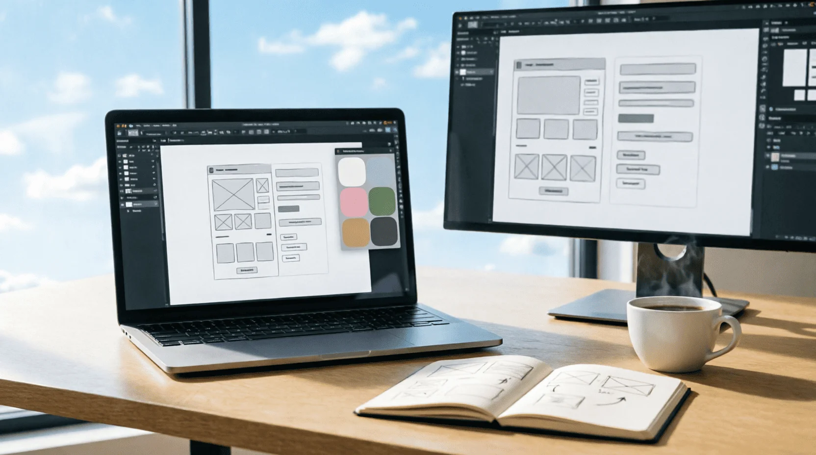
UI/UX-дизайн 2026: как стать востребованным дизайнером интерфейсов - от первого макета в Figma до зарплаты 1 млн тенге: портфолио, профессии, нейросети и вход в индустрию без диплома
UI/UX-дизайн - одна из самых востребованных креативных профессий 2026 года: зарплаты от 400 тысяч до 2 млн тенге, удалённая работа на зарубежные компании и вход без диплома. Команда Lemag.kz разобрала профессию без мифов: инструменты (Figma, AI), портфолио без опыта, зарплаты по уровням, казахстанский рынок и план первых 90 дней - от нуля до первого оплачиваемого проекта.
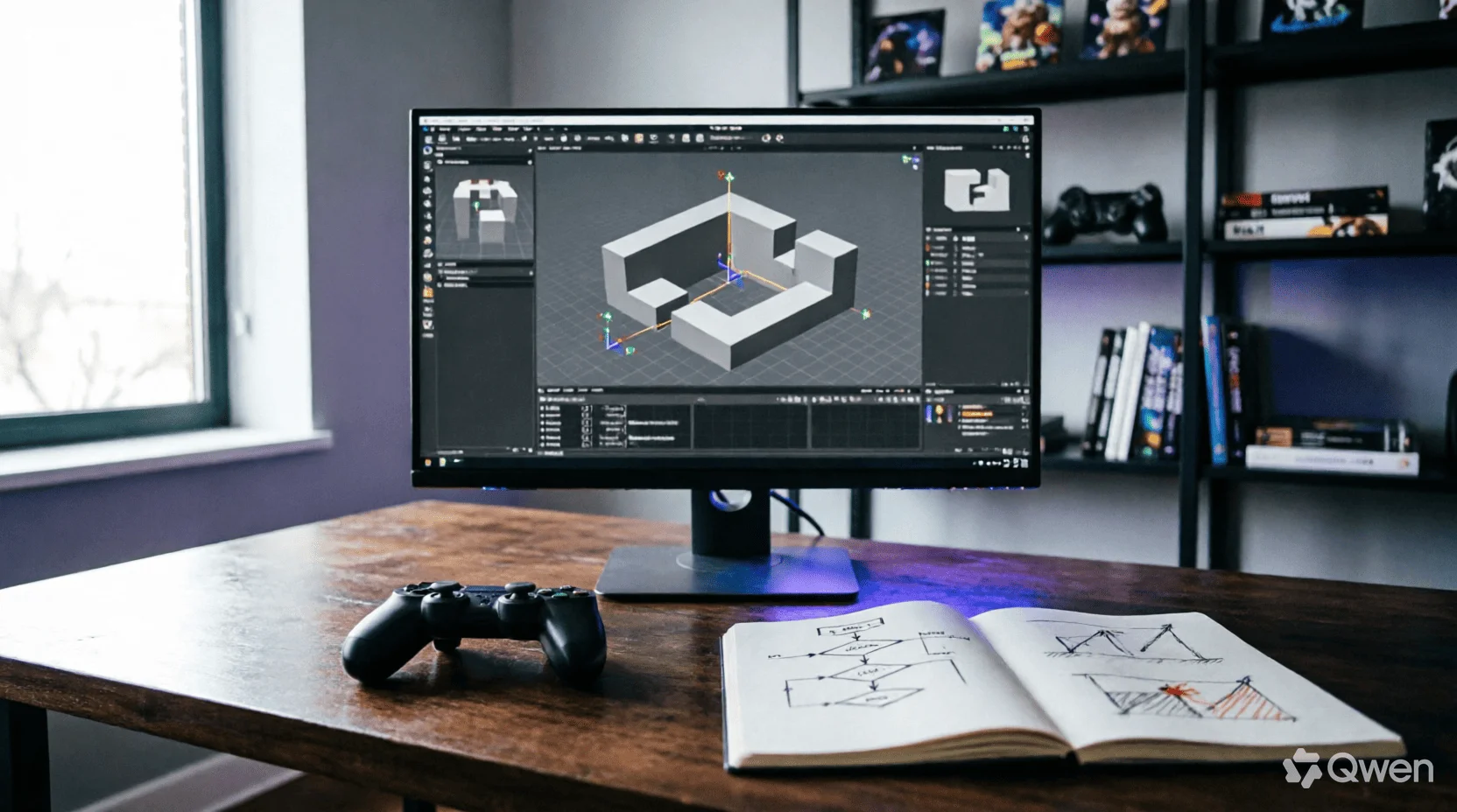
Геймдизайн 2026: как устроена профессия, которая соединяет все искусства - от core-loop до казахского сеттинга: движки, психология игрока, экономика F2P и вход в индустрию без диплома
Игры - единственная среда, где архитектура, музыка, нарратив и психология работают одновременно и подчинены одному решению геймдизайнера: что игрок почувствует в следующую секунду. Команда Lemag.kz разобрала профессию без романтизации: анатомия core-loop, сравнение движков 2026 года, тёмные паттерны монетизации и их этичные альтернативы, казахский сеттинг как конкурентное преимущество и реалистичный план первой игры за 90 дней - без диплома и без иллюзий.

Packaging Design 2026: Packaging That Sells – From the Label to the Unboxing Experience
Packaging is the only selling point that meets every customer: on the shelf, it lasts 3 seconds, and in a marketplace listing, it lasts 300 milliseconds in thumbnail form. The Lemag.kz team analyzed the anatomy of packaging that sells: label hierarchy, materials and color, mandatory EAEU requirements, the unpacking ritual, and the economics of printing in tenge—with a self-audit checklist for your product.
💬 Comments (0)
No comments yet. Be the first!
Leave a comment
Comments are pre-moderated.