
UX/UI Design 2026: How to Create Interfaces That Sell – From User Research to Live Prototyping
An interface is like a salesperson who works 24/7 and never tires. But a bad salesperson gets confused in their answers, hides prices, and forgets the way to the checkout. In the digital world, this is called bad UX, and it costs businesses up to 70% of abandoned carts. The teamLemag.kzShe went from user research to live prototyping on her own products and compiled a complete 2026 UX/UI design guide—complete with metrics, case studies, and local specifics for Kazakhstan.

1. UX, UI, and the Cost of Error
? UX (user experience)— product logic: what problems it solves, what path the user takes, where they stumble; this is the structure and scenarios.
? UI (user interface)— the visual layer: grids, components, color, typography; what the eye sees as it moves along the path.
? The cost of error.Industry research consistently shows that up to 70% of shopping carts are abandoned due to complicated checkout, unexpected shipping costs, and mandatory registration; every simplified checkout step is a revenue loss, not a "beauty" feature.
A beautiful interface with bad UX is like a boutique window with no doors: you can admire it, but you can't buy it.
2. Research: Five interviews instead of a month of debate
? Interviews with clients.Five 30-minute conversations answer questions the team has been debating for months: why they come, what they're afraid of, what annoys them.
? Behavior analytics.Click maps, funnels, session recordings: the numbers show where users are actually getting stuck, not where the team "thinks" they are.
? Jobs to be Done.People don't "buy an app"—they "hire" it to perform a task: "quickly pay a bill in line," "find a gift in an evening." Formulate the task as a verb, not a feature.
? CJM (customer journey map).The journey from "heard about the brand" to "paid and told a friend" is filled with emotion at every step; the red zones of the map are the designer's backlog of tasks.
3. Information and scenarios: skeleton to pixels
? Information architecture.The section tree is tested using "card sorting": let five users arrange the menu items as they see fit—their logic is more important than the company's internal organizational structure.
? User flow.The path to the main goal (payment, registration, application) is drawn as a diagram before the design; the rule: no more than seven steps and no dead ends without a way out.
✂️ Screen priorities.One screen, one main task; anything that distracts from it is moved lower or disappears.
4. Wireframes: Cheap Mistakes Instead of Expensive Ones
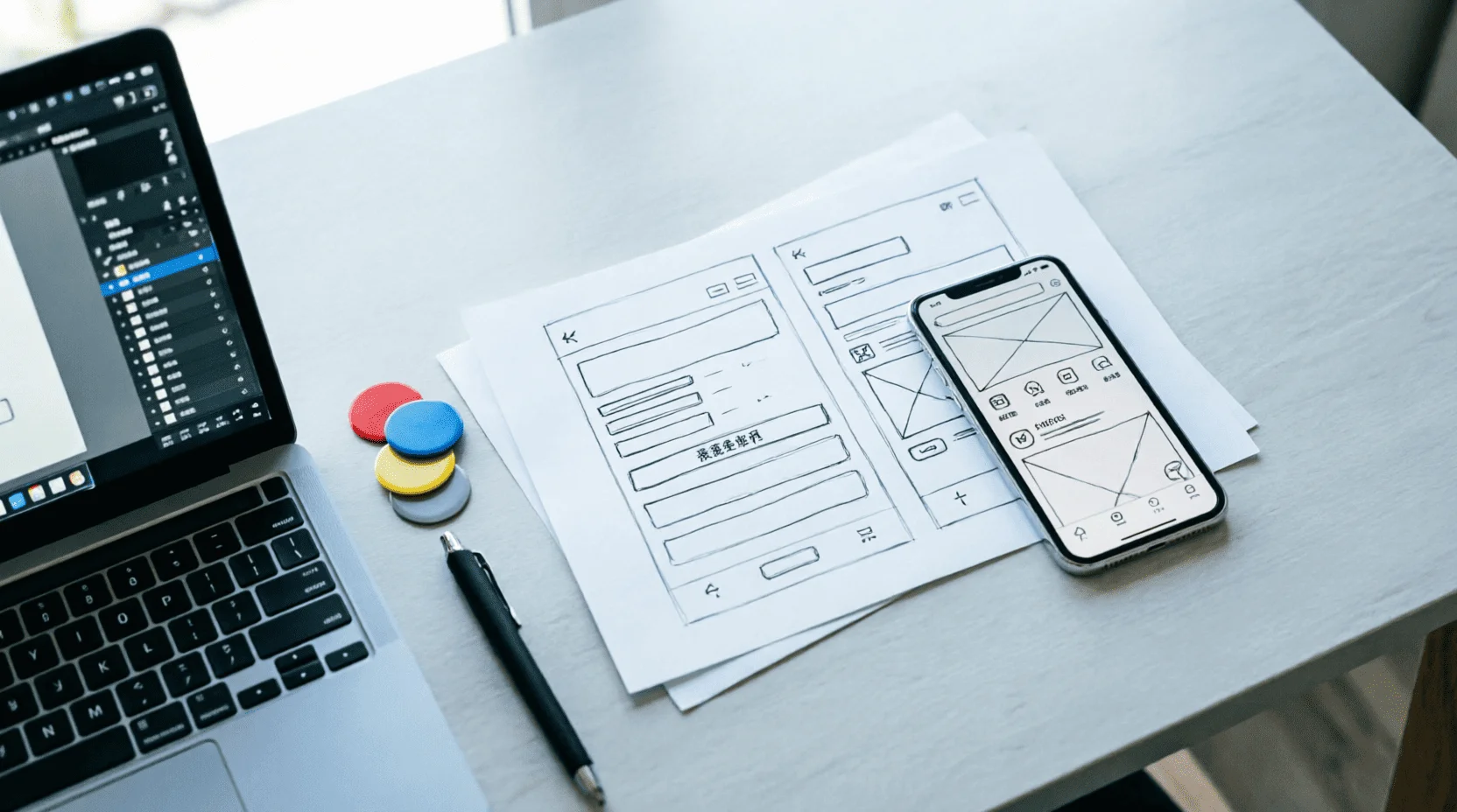
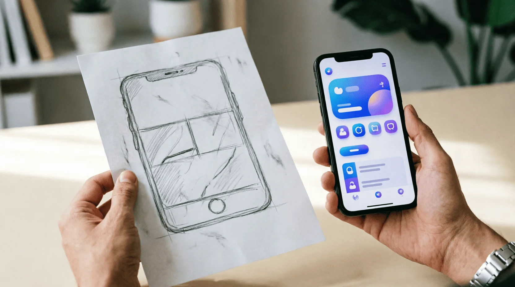
✏️ Low-fi first.Black-and-white screen diagrams on paper or in FigJam: editing a line on a wireframe costs a minute, editing a finished layout costs an hour, editing the code costs a day.
? Disputes are resolved by testing.Two wireframe versions are shown to five people with the task "Where will you click?" - it is not the director's opinion that wins, but the behavior.
? The grid appears here.The 8-pixel grid and modules are laid down at the wireframing stage, not as a “we’ll tweak it later” approach.
5. UI layer: design system instead of chaos
? Components.Buttons, fields, cards, and alerts are collected once in the Figma library and reused; a new screen can be created in hours, not days.
? Tokens.Color, padding, radius, and shadows are stored as variables (tokens): changing a brand = editing tokens, not hundreds of layouts manually.
? Typography in the interface.Font size, hierarchy, and readability of on-screen text follow the rules of our article on typography: 16 px minimum, line spacing 1.4–1.6, line length 45–75 characters.
Dark theme.Designed in parallel, not "inverted later": contrasts and shadows behave differently on a dark background.
6. Accessibility: Interface for everyone
♿ WCAG base.Text contrast of at least 4.5:1; clickable areas of at least 44 pixels; keyboard focus states; alternative text for images—we fixed alt text on our own website and saw an increase in image traffic.
? Age and relationship.A user over 50 on an inexpensive phone with 3G is the same client as a designer with a flagship phone on Wi-Fi; large font sizes and lightweight pages pay off more than they seem.
? Language and localization.Bilingual interfaces in Kazakhstan (Kazakh/Russian) require identical font sizes and space: Kazakh words are 10–20% longer than Russian ones, and "the button went" is a classic feature of local products; support for Kazakh graphics is discussed in our article on typography.
7. Microinteractions and Motion: Movement with Meaning
Response to action.The button responds within 100-150ms; skeletons replace spinners during loading; animation explains where the screen came from and where it went.
? Motion budget.Motion is limited to 300ms and only where it explains the transition; decorative animation is tiring and slows down weaker devices.
? Platform habits.iOS and Android have their own navigation patterns; fighting them in the name of "originality" costs conversions.
8. Prototype and test on five users
? Living prototype.A Figma prototype with clickable scenarios replaces months of development to test hypotheses.
? Test scenario.The task in real-life terms is: "choose a gift for your sister under 20,000 tenge and proceed to checkout" – not "find the gift section."
? Five users.The first circle finds up to 85% of problems; we fix them – the second circle confirms; more people = the same findings are more expensive.
? Fixation.Each issue = a line item in the backlog with severity and frequency; the designer defends edits with numbers, not taste.

9. Metrics: How to Know if UX Has Improved
? Target action conversion.The percentage of those who reach payment/application is the main figure of the product.
✅ Success rate and task time.Percentage and speed of script execution in the test before and after the redesign.
? SUS survey.Ten questions about satisfaction after the session; a score above 68 is above the industry average.
? Abandoned carts and support.A decline in "I can't pay" support requests is the most honest indicator of a checkout's health.
10. Kazakhstan's Local Context: Patterns That Work
? Kaspi's habit.Users in Kazakhstan are accustomed to super-apps: payment in two taps, QR codes at the checkout, chat instead of a call; interfaces that replicate these patterns are perceived as "native," while foreign ones are perceived as "complicated."
? Mobile priority.Up to 80–90% of local service traffic comes from smartphones; mobile-first is not a methodology here, but a reality.
? Bilingualism as the norm.The language switch is in the header, not the footer; the Kazakh version is a full-fledged product, not a "tick-box" translation: it benefits the audience, loyalty, and meets government customer requirements.
? Lemag.kz case.Our own store lives by these rules: a product card with price and availability above the fold, a three-step checkout, card and QR code payment—conversion increases with each simplified form; we showcase the creative side of these solutions in special projects.

11. AI in UX 2026: An Assistant, Not an Author
? Generative drafts.AI generates initial screen and button text designs in minutes; the designer selects, edits, and is responsible for the results.
? Analysis of reviews and support.Assistants cluster hundreds of requests into problem topics—the CJM is updated automatically.
? Personalization.Interfaces adapt the order of blocks to the user's scenario; but predictability trumps surprises: navigation remains stable.
⚖️ Border.Decisions about structure and ethics (dark patterns, manipulation) are made by humans; AI is not responsible for conversion or reputation.
12. Dark Patterns: A Shortcut to Long-Term Problems
? Classic scam:Hidden subscription with a checkbox, "cancel" in gray on gray, shopping cart with extra items, countdown timer for no reason.
? Consequences.Reviews, unsubscribes, complaints to antitrust authorities and platforms; in 2026, regulators in various countries will directly fine people for dark patterns—saving on conversions results in fines and reputational damage.
✅ Honest alternatives.Transparent pricing from the very first screen, one-click cancellation, and clear consents—trust converts into repeat purchases more effectively than a one-time ploy.
13. UX Mistakes That Cost Money
? Mandatory registration before purchase.A guest checkout with an offer to create an account after payment provides a 20–40% conversion rate boost.
? Hidden delivery.Delivery price and terms - before the cart, not at the last step.
? Endless filters and forms.Each extra form field reduces the completion rate by 7–10%; ask only for information that is essential to completing the task.
? Empty states with no exit.An empty cart or "nothing found" should lead further: recommendations, search, contact - a dead end kills a session.
? Speed.A one-second delay in loading time means a few percent less conversion; image and code optimization is part of UX, not a backend task.
14. Case Study: Product Card Before and After
? Before:Price below the description, "Buy" button below the reviews, three delivery options without prices, photos without zoom.
? Edits:Price and availability above the fold, sticky buy button when scrolling, delivery with price and delivery time in two taps, zoomable photos and videos of the product, and first-come, first-served customer reviews.
? After:Card conversion rate +18–30% according to e-commerce industry benchmarks; we applied the same adjustments to our store and saw similar results.
15. Tools and path to entry into the profession
? Stack 2026.Figma (mockups, components, prototypes), FigJam (research and CJM), Maze and Useberry (remote testing), Hotjar analogs (heatmaps), tokens and design systems in Figma Variables.
? Entry path.A redesign of a well-known service, including an analysis of "what's broken and why" → three case studies with before/after metrics → first freelance tasks; details on entering the profession – in our article on design professions.
? Base.Steve Krug's "Don't Make Me Think," "The Psychology of Web Design," platform guidelines, and WCAG—read in two weeks and last a lifetime.
16. Links to other Lemag.kz articles
? Typography— screen readability and Kazakh graphics in interfaces.
? Visual brand language— an identity that lives within the product through tokens and components.
? Design Professions— UX/UI as the most highly paid branch of the craft and an entry point.
? Neural networks for content— AI-powered screen drafts and feedback analysis in the workflow.
Result:UX/UI design in 2026 isn't about "making it pretty," but about engineering trust: research instead of debate, wireframes instead of costly mistakes, a design system instead of chaos, five-user testing instead of personal preference, and metrics instead of experience. Add Kazakhstan's local patterns—mobility, bilingualism, the habit of paying in two taps—and the interface ceases to be a doorless display case: it becomes a salesperson who never tires and always knows the way to the checkout. ?
❓ FAQ
How is UX different from UI?
UX (user experience) is the user's logic and journey: structure, flow, and usability; UI (user interface) is the visual layer: grids, color, and components. UX determines "where to go," while UI determines "how it looks along the way."
How much does UX research cost for small businesses?
A team-led mini-research is free: 5 client interviews and analytics analysis within a week; a custom research study with CJM and a report costs from 300,000 to 1.5 million tenge, depending on the depth.
How many users are needed for interface testing?
Five: According to the classic usability industry theory, five users find up to 85% of problems; the second round of five finds problems after fixes; testing on 20+ people yields the same findings at a higher cost.
What is a design system and does a small product need one?
This is a library of components and rules (buttons, forms, indents, color tokens); it's essential from the third or fourth screen: it speeds up the assembly of new pages by 2-3 times and maintains a consistent style.
What are dark patterns and why are they dangerous?
User deception techniques: hidden subscription checkboxes, inability to cancel orders, "I confirm" in small print; gains now and losses in reputation, reviews, and complaints to antitrust authorities later.
How to measure the success of UX changes?
Four metrics: target action conversion, task success rate, task time, and SUS (satisfaction) survey; compare before and after on the same traffic.
Where to study UX/UI in 2026?
Real-world practice is more powerful than courses: redesigning a well-known service for your portfolio, freelance case studies, and analyzing other people's interfaces; tools include Figma, FigJam, and Maze; and a foundation in Krug's "Don't Make Me Think" and Nielsen's books.
📚 Read also

Packaging Design 2026: Packaging That Sells – From the Label to the Unboxing Experience
Packaging is the only selling point that meets every customer: on the shelf, it lasts 3 seconds, and in a marketplace listing, it lasts 300 milliseconds in thumbnail form. The Lemag.kz team analyzed the anatomy of packaging that sells: label hierarchy, materials and color, mandatory EAEU requirements, the unpacking ritual, and the economics of printing in tenge—with a self-audit checklist for your product.

Typography 2026: How to Choose and Combine Fonts – A Practical Guide for Brands, Websites, and Social Media
Design is 90% text, so typography is design. The Lemag.kz team has put together a practical guide on how to read a font's "character," combine pairs without resorting to taste, maintain web readability, and avoid failure in Kazakh script, where the letters Ә, Ғ, Қ, Ң, and Ө are not supported by half of the beautiful fonts. It includes ready-made pairs, licenses, and a checklist of errors.

Design Professions 2026: Who the Market Needs, How Much They Pay, and How to Get Started in 12 Months
Design in 2026 isn't a "gift from God," but a set of masterable skills with clear entry points: from graphics in three months to UX in a year. The Lemag.kz team laid out a map of professions with income ranges in tenge, demonstrated what AI takes away and what it gives, and put together a 12-month roadmap from zero to first clients, complete with a portfolio checklist.
💬 Comments (0)
No comments yet. Be the first!
Leave a comment
Comments are pre-moderated.