
Typography 2026: How to Choose and Combine Fonts – A Practical Guide for Brands, Websites, and Social Media
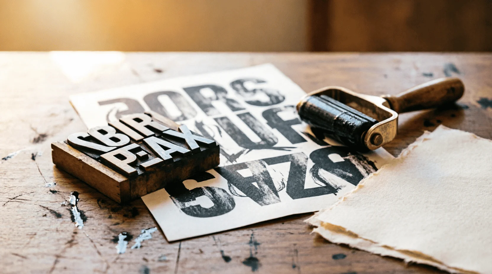
Design is 90% text—logos, interfaces, posters, posts: everywhere, letters come first, everything else comes second. Therefore, typography isn't a "design department," but the supporting structure of design: a bad font destroys trust faster than a bad logo. TeamLemag.kzI've compiled a practical guide for 2026: font characteristics, pairing rules, web readability, and Kazakh graphics, where half of the beautiful typefaces fail.
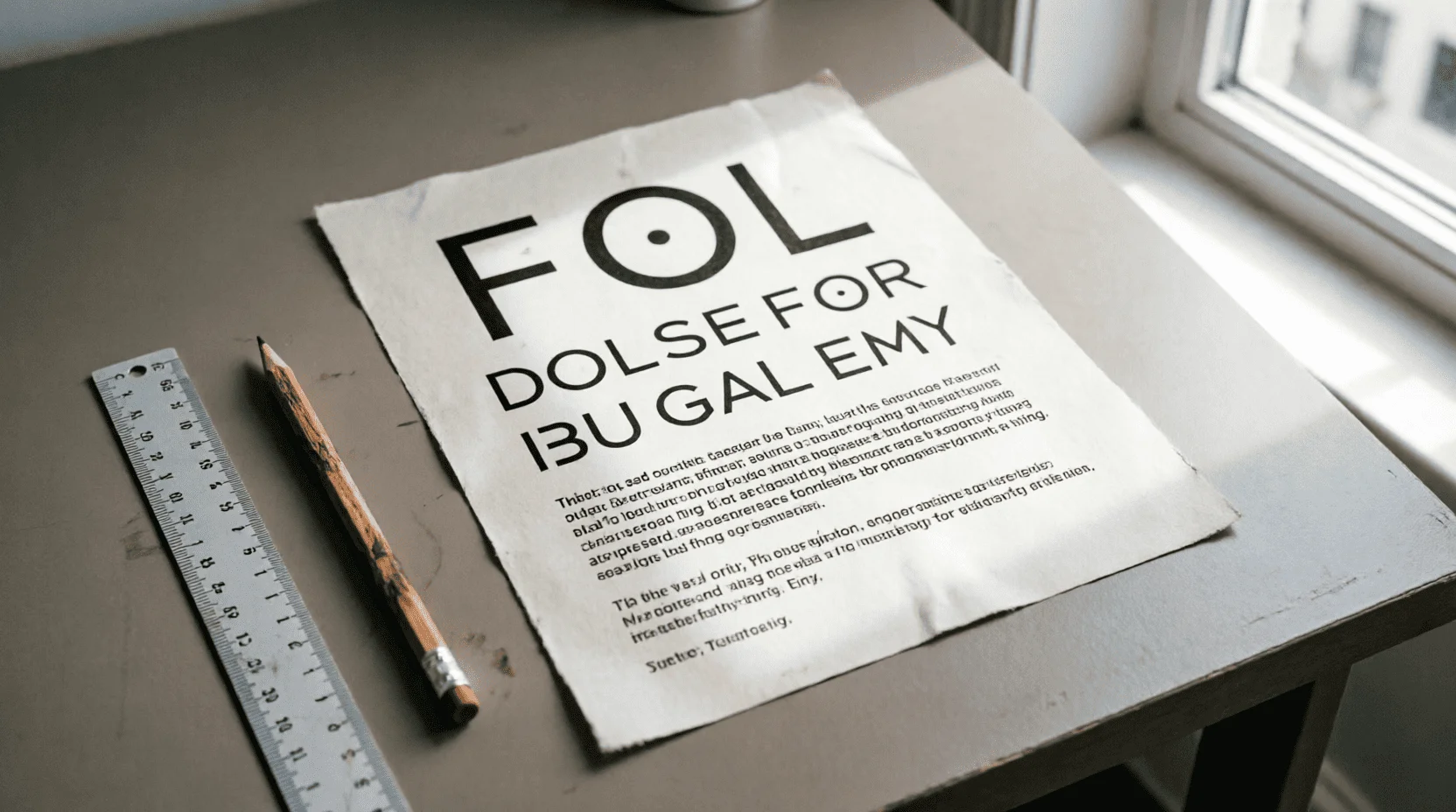
1. Five-Minute Vocabulary: Font Size, Leading, Kerning
? Skittle— font size;leading— distance between lines;kerning— the distance between pairs of letters;tracking— between all letters at once.
? Hierarchy— a system of sizes and weights that guides the eye: heading → subheading → text → caption; the reader should understand the structure without reading the words.
? Typeface and font.A typeface is a family (for example, a grotesque family), and a font is a specific style of the family: Regular, Bold, Italic.
Typography is the voice of design: font size and spacing speak volumes about a brand before the words themselves.
2. Four families and their characters
? Antiqua (serif).Tradition, expertise, premium quality; newspapers, jewelry brands, publishing houses. On the web – for accents and premium landing pages.
? Grotesque (sans serif).Neutrality, technology, clarity; interfaces, corporate websites, mass brands – the workhorse of the era.
? Monospaced.Code, numbers, tables, "technical" character; dosed - like a spice.
? Display (accidental).Posters, logos, covers; they scream character, but don't hold up well to long text and small font sizes.
Character Rule:First comes the brand's emotion (from the article on visual language), then the family; a font that clashes with the voice reads as false.
3. The Anatomy of Readability: Why One Font Works and Another Doesn't
? Lowercase height (x-height).The higher the font size, the larger and friendlier the text looks at the same font size.
? Apertures.Open "o", "e", "s" are better read in small sizes and on screens.
〰️ Stroke contrast.High contrast (thin/thick lines) is elegant in print, dangerous on screens; low contrast is reliable on the web.
? Three size test.The text font candidate is checked at 16 px, 12 px, and 600-character paragraphs; if it fails in any of them, it's only in headings.
4. Rules of combination: contrast, not conflict
? Contrast of families.Display serif in headings + neutral sans serif in text – a classic that always works.
?? Superfamilies.One typeface with a wide range of weights and widths is the safest way: contrast is in the DNA.
? Conflict of similarities.Two grotesques "almost identical" create the feeling of a mistake, not a pair; either clearly different, or one family.
? Third - mono.Monospaced for numbers, prices, codes, dates - adds technical texture without the fourth voice.
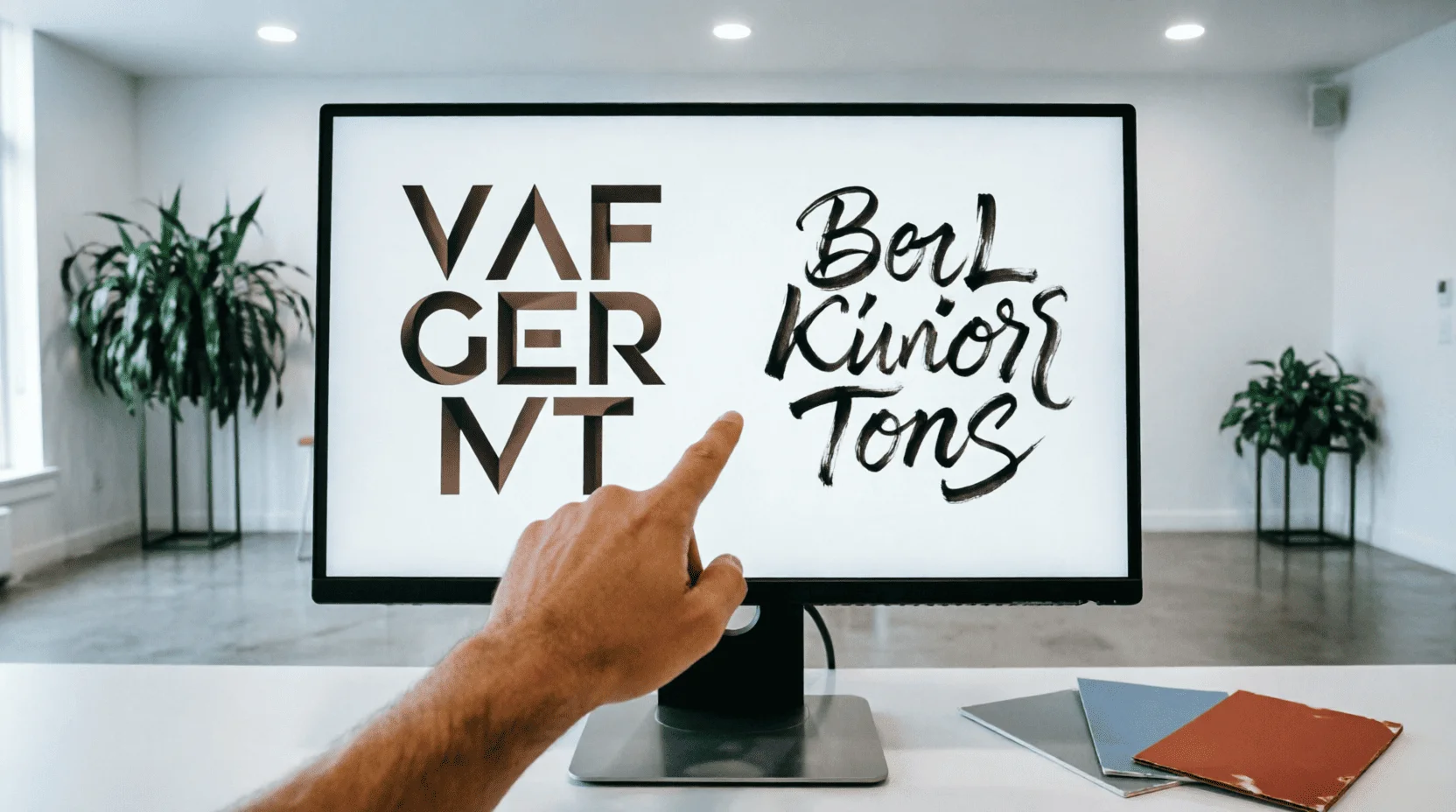
5. Ready-made pairs 2026: take and use
Five proven combinations
- Display Antiqua + Neutral Grotesque— premium landing pages and magazine layouts.
- Characteristic grotesque + systemic grotesque— technological products and startups.
- Geogrotesque in headlines + humanistic grotesque in the text- friendly services and education.
- Mono in accents + grotesque in text— fintech and developer products.
- Display Cyrillic Accident + Grotesque— posters, events, social networks.
Rule of application:pair + one constant (mono or italic) - ceiling; the fourth voice destroys the choir.
6. Web Typography: Numbers That Save Text
? Line length.45–75 characters: shorter – ragged rhythm, longer – the eye misses the beginning of the next line.
? Text font size.16–18 px on desktop, 15–16 px on mobile; “small and elegant” = unreadable.
↕️ Leading.1.4–1.6 for text; for large headings, on the contrary, denser (0.95–1.1).
Color and contrast.Text-to-background contrast should be no less than 4.5:1 (WCAG accessibility standard); gray on gray is aesthetics versus people.
⚡ Loading.Font-display: swap and Cyrillic subsets prevent the text from "flashing" empty and load more easily.
7. Typography on social media and covers
? Hierarchy in 1 second.The cover is read in the feed in a second: one large accent, one supporting one, the rest is in the signature.
? Headline tracking.Large caps headings prefer light negative tracking and dense line spacing; small caps prefer positive tracking for air.
? Contrast stripes.Text on a photo should only be applied with a background or gradient; "just on top" is a dead giveaway on any colorful frame.
? Safe zones.The key words are in the center of the frame: the edges are eaten up by the platform interfaces.
8. Font in logo and identity
✍️ Lettering vs font.A logo made from a ready-made font without any modifications is a risk of recognition: the same font will be found in a neighboring brand; modifications with ligatures and shapes make the logo unique.
? Brand DNA.The identity font should rhyme with the logo: character, proportions, contrast—we discussed this system in the article on brand visual language.
? Carriers.Check the identity font on your favicon, sign, packaging, and stories—a beautiful font in a presentation breaks at 16 pixels.
9. Kazakh graphics: where beautiful fonts break down
? Eight letter detectors.Ә, Ғ, Қ, Ң, Ө, Ұ, Ү, Һ — half of Western and even Russian typefaces do not have Kazakh glyphs: letters fall out in “squares” or are substituted from another font — the identity is crumbling before our eyes.
✅ How to check.Test line “Әә Ғғ Ққ Ңң Өө Ұұ Үү Һһ” in the preview + “Kazakh” filter in Google Fonts; for brands - written confirmation of glyphs from the font manufacturer.
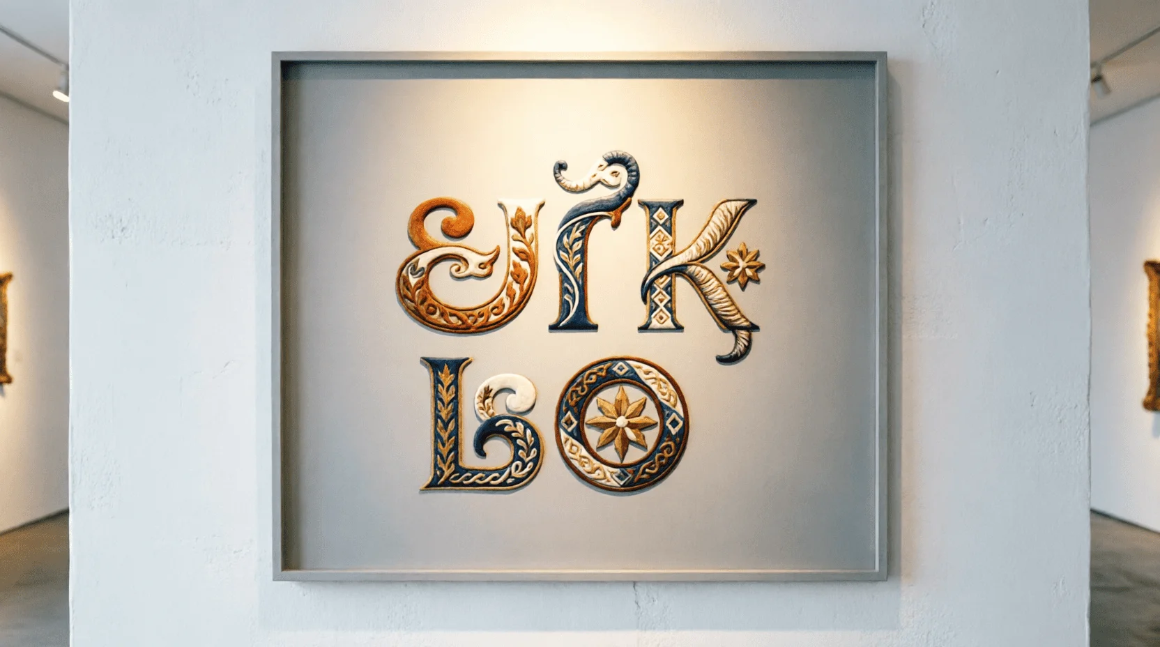
? Local projects.Kazakh-language typography is a growing school: ornamental lettering waves and modern Cyrillic typefaces with Kazakh support give brands a unique voice—the neo-nomad code from our article lives on in the letters.
? Bilingual layouts.The RU+KZ versions of the site require a font with both supports and the same metrics to ensure the layout doesn't "jump" between languages.
10. Licenses: Where to Get Fonts and Avoid a Lawsuit
? Free and legal.Google Fonts (OFL license - commercial use permitted), Open Font Library, projects by independent designers with an open license.
? Paid and reliable.Paratype, Type.today, Fontspring: project or brand license; for brand identity, an extended license with the right to modify.
? Pirate "download free font".For a commercial brand, this is a direct legal risk: copyright holders track usage and issue invoices; a savings of 20,000 rubles turns into hundreds.
? Rule:The license is part of the brand design file; keep the document next to the guidelines.
11. Typography Trends 2026
? Variable fonts.One file – a range of typefaces; live web typography and page weight savings.
? Kinetic typography.Letters in motion: reels and title cards where text is the main character of the frame; we demonstrated these connections in our article on neural networks for content.
? Large grids and brutalist headings.Huge caps blocks as a layout architecture are fashionable, but in moderation.
? AI-based matchmaking.Assistants suggest pairs based on references—quickly, but the final word is up to the individual: taste remains a craft.
12. Mistakes that kill a layout
? More than three votes.Every new font after the third one destroys the hierarchy.
? Default line spacing.1.0–1.2 in the text — stuck together lines; 1.6+ in headings — broken character.
? Gradients and strokes on text.2007 effects; text should work with form and contrast.
? Caps in long text.CAPS IS READ SLOWER AND SOUNDS LIKE A SHOUT - only in accents.
? Text on a colorful background without a backing.Beautiful in the layout, illegible in real life.
13. Exercises: How to develop a typographic eye
? Four 20-minute practices
- Copying masters.Once a week, manually type a successful layout, analyzing the font sizes and spacing.
- One font - five hierarchies.Assemble the poster as one family, changing only the weight and size.
- Test strings.Run candidates through “Әә Ғғ Ққ Ңң Өө” and a paragraph of 600 characters in 16 px.
- Analysis of signs.Photograph street typography and explain what's broken—the best school of observation.
14. Links to other Lemag.kz articles
? Visual brand language— a system in which font is one of the three pillars, along with color and rhythm.
? Neonomadism— ornamental code in lettering and Kazakh-language identities.
? Neural networks for content— kinetic typography and AI-based pairing.
? Design Professions- typography as a basic skill that a portfolio starts with.
Result:Typography is the voice of design: font size, spacing, and the character of the font speak to the brand before the meaning of the words. Maintain two or three voices, family contrast, web readability metrics, and the mandatory Kazakh glyph test—and your layouts will sound clean on any medium, from a favicon to a sign. Start with these four exercises—in a month, your eye will automatically recognize the grid and false characters. ?
❓ FAQ
How many fonts can I use in one project?
Two or three: one for headings (characteristic), one for text (readable), optionally monospaced for numbers and code; more creates visual noise and loss of hierarchy.
How can I check if a font supports Kazakh letters?
Open the glyph panel (Google Fonts: “Language” → Kazakh) or insert the test string “Әә Ғғ Ққ Ңң Өө Ұұ Үү Һһ” into the preview; if the letters appear in squares or are replaced, the font is not suitable.
Where can I get fonts for commercial use legally?
Google Fonts and Open Font Library are free with a commercial OFL license; paid options include Paratype, Type.today, and Fontspring, all with a project-specific license; "free downloads" from pirated sites pose a legal risk to the brand.
What is the difference between font size and line spacing?
Font size is the font size; leading is the distance between lines; for web text, leading of 1.4–1.6 times the font size is the standard for readability.
Which font should I choose for my brand?
First, character: geogrotesques – technological and neutral, grotesques with character – friendliness, serifs – tradition and premium, display serifs – only accents; the font should speak in the same way as the brand voice from the article on visual language.
What are variable fonts and why do we need them in 2026?
A single file with smooth weight and width adjustments; faster loading and vibrant typography for web and motion graphics—the main tech trend of the year.
How can a beginner quickly improve their typography skills?
"Copying the Masters" exercise: Once a week, manually type someone else's successful layout, analyzing the font sizes and spacing; after 10 repetitions, your eye will begin to see the grid automatically.
📚 Read also

Neuroaesthetics: How the Brain Perceives Design - From the Golden Ratio to Color Triggers: The Science of Beauty, Perception Psychology, and Practical Application
Why do some designs evoke delight and the desire to share, while others leave us indifferent? Neuroaesthetics is the science of how the brain processes visual information. The Lemag.kz team breaks down fundamental principles: the golden ratio, color triggers, attention patterns, and practical application in design, branding, and art.
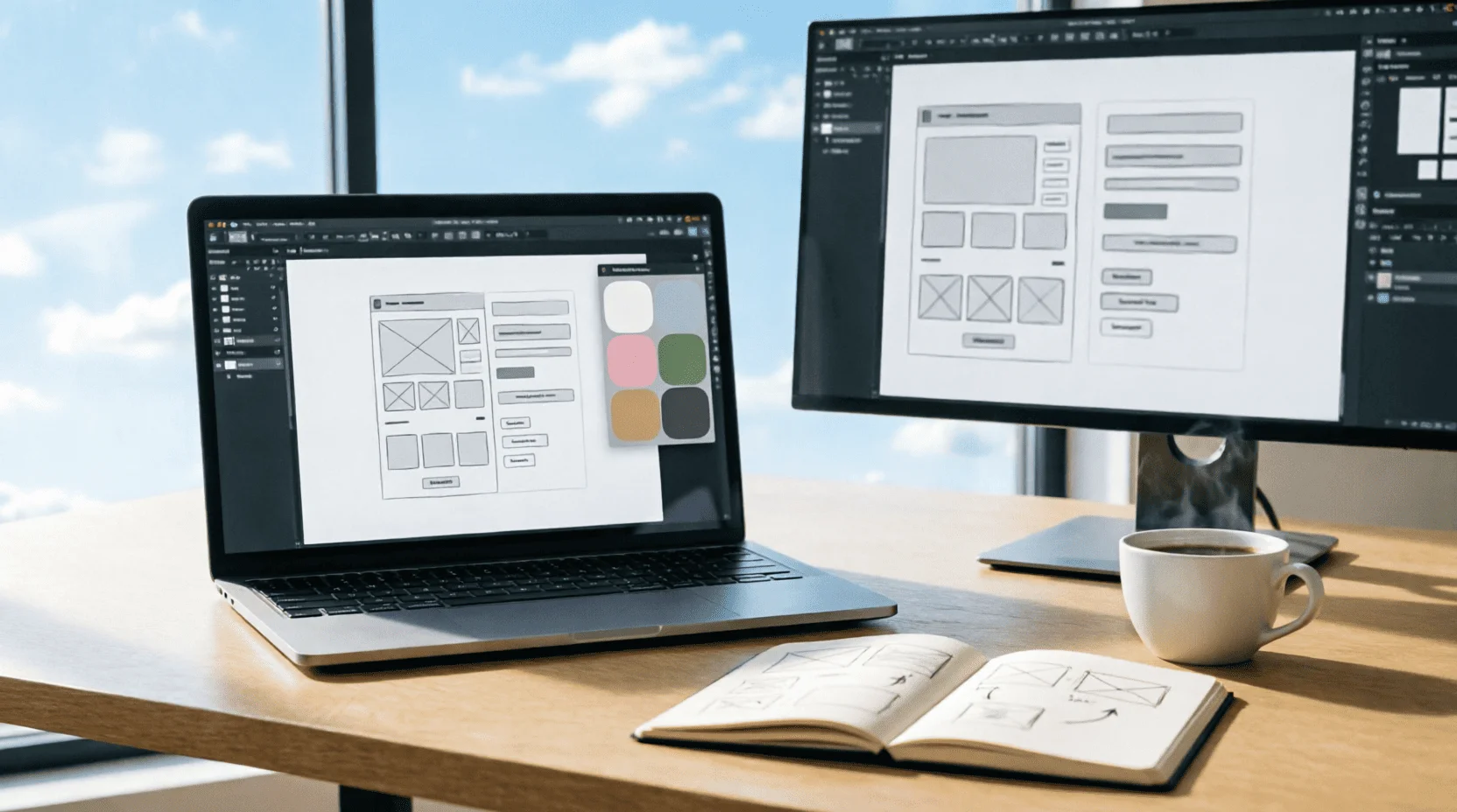
UI/UX-дизайн 2026: как стать востребованным дизайнером интерфейсов - от первого макета в Figma до зарплаты 1 млн тенге: портфолио, профессии, нейросети и вход в индустрию без диплома
UI/UX-дизайн - одна из самых востребованных креативных профессий 2026 года: зарплаты от 400 тысяч до 2 млн тенге, удалённая работа на зарубежные компании и вход без диплома. Команда Lemag.kz разобрала профессию без мифов: инструменты (Figma, AI), портфолио без опыта, зарплаты по уровням, казахстанский рынок и план первых 90 дней - от нуля до первого оплачиваемого проекта.
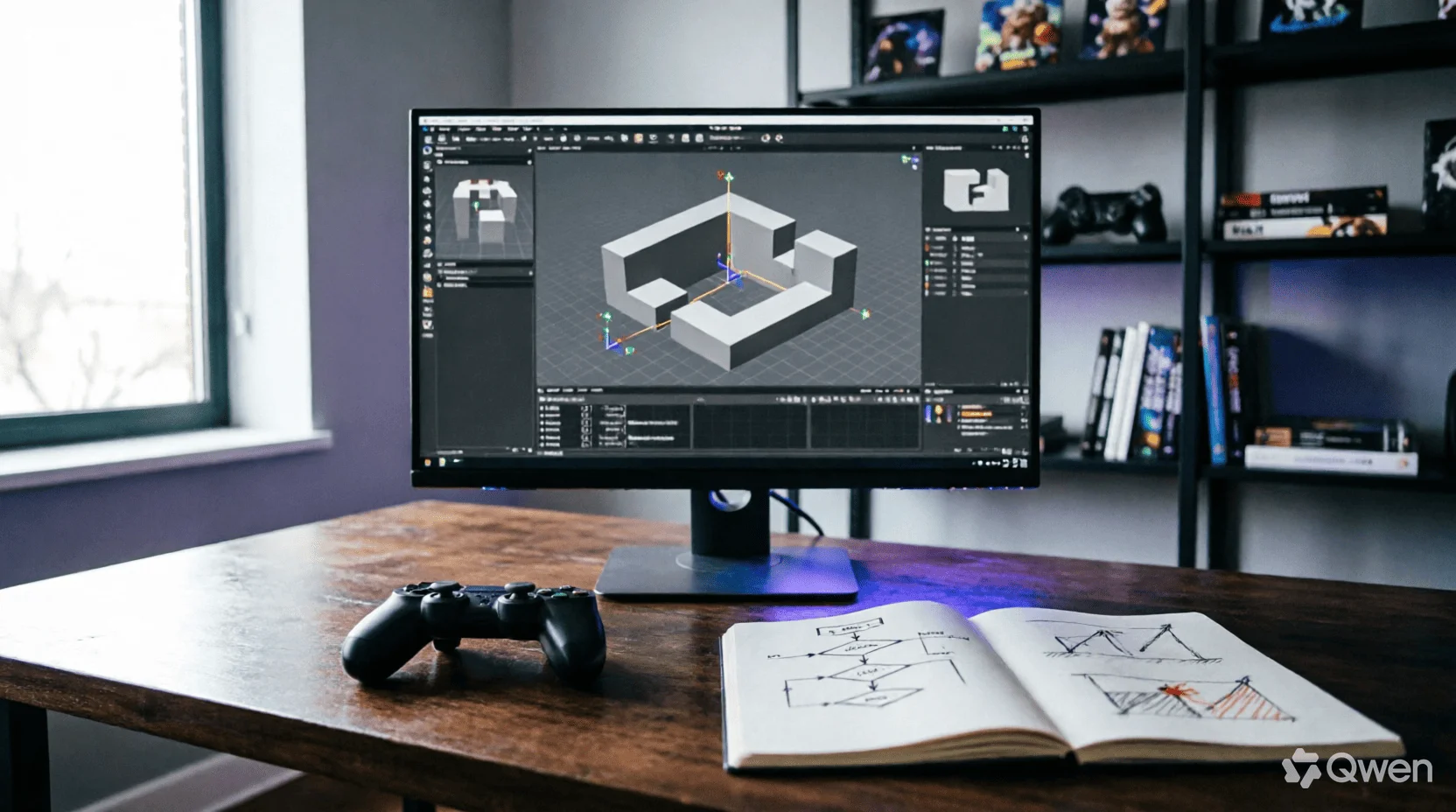
Геймдизайн 2026: как устроена профессия, которая соединяет все искусства - от core-loop до казахского сеттинга: движки, психология игрока, экономика F2P и вход в индустрию без диплома
Игры - единственная среда, где архитектура, музыка, нарратив и психология работают одновременно и подчинены одному решению геймдизайнера: что игрок почувствует в следующую секунду. Команда Lemag.kz разобрала профессию без романтизации: анатомия core-loop, сравнение движков 2026 года, тёмные паттерны монетизации и их этичные альтернативы, казахский сеттинг как конкурентное преимущество и реалистичный план первой игры за 90 дней - без диплома и без иллюзий.
💬 Comments (0)
No comments yet. Be the first!
Leave a comment
Comments are pre-moderated.